
Data Scientist
Analyze Geospatial Data in Python: GeoPandas and Shapely
This article is the first out of three of our geospatial series.
Geospatial data have a lot of value. Our Geospatial series will teach you how to extract this value as a data scientist.
- This 1st article introduces you to the mindset and tools needed to deal with geospatial data. It also includes a reincarnation of what has become known as the first spatial data analysis ever conducted: John Snow's investigation of the 1854 Broad Street cholera outbreak.
- The 2nd article will dive deeper into the geospatial python framework by showing you how to conduct your own spatial analysis.
- The 3rd article will apply machine learning to geospatial data.
Intro to Geospatial Data
Geospatial data describe any object or feature on Earth's surface. Common examples include:
- Where should a brand locate its next store?
- How does the weather impact regional sales?
- What's the best route to take in a car?
- Which area will be hit hardest by a hurricane?
- How does ice cap melting relate to carbon emissions?
- Which areas will be at the highest risk of fires?
Answers to these questions are valuable, making spatial data skills a great addition to any data scientist's toolset.
The Basics
Let's start by learning to speak the language of geospatial data. At the end of this section, you will know about:
- Vector vs. raster data
- Geographic Reference Systems (CRS)
- The difference between Georeferencing and Geocoding.
Vector
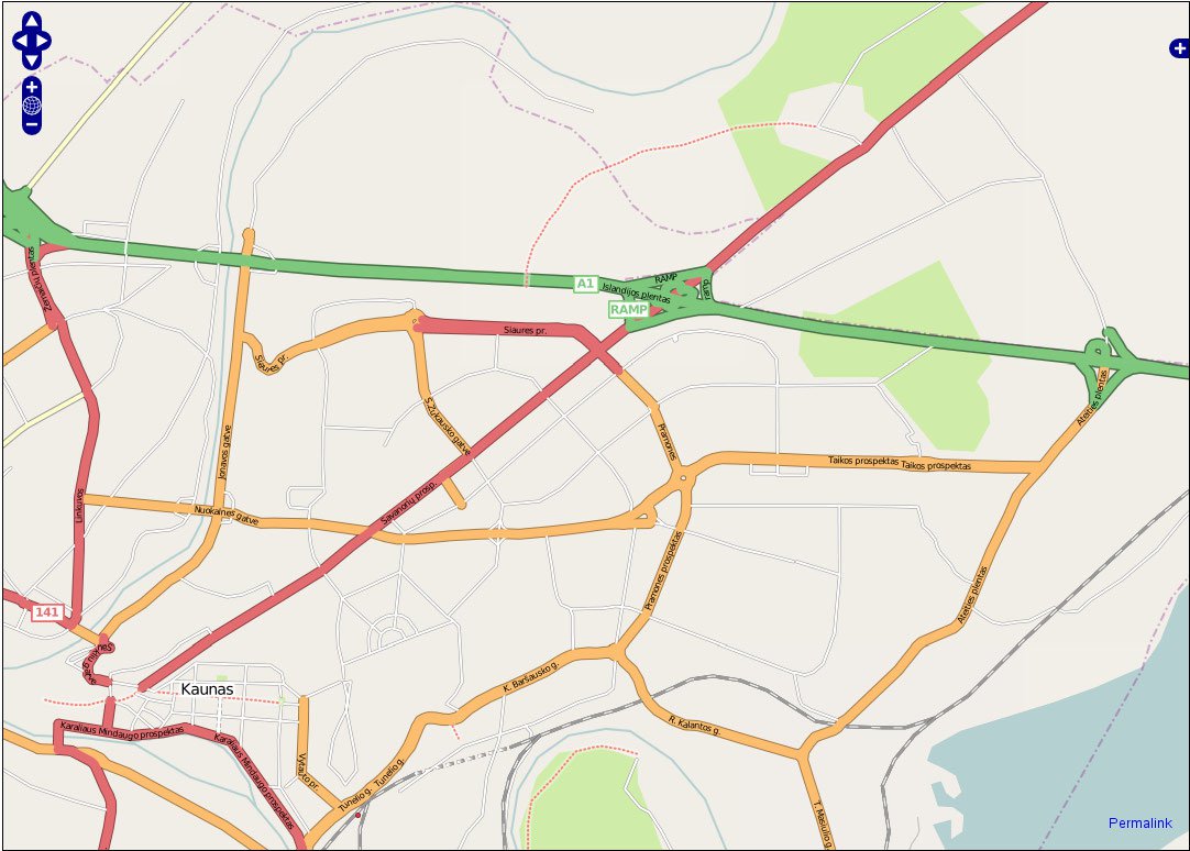
Vector data represent geometries in the world. When you open a navigation map, you see vector data. The road network, the buildings, the restaurants, and ATMs are all vectors with their associated attributes.
Note: Vectors are mathematical objects. Unlike rasters, you can zoom into vectors without losing resolution.
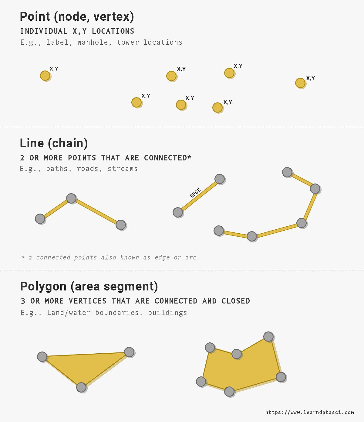
There are three main types of vector data:
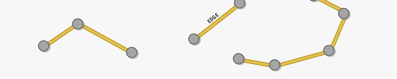
- Points
- Lines. Connecting points creates a line.
- Polygons. Connecting lines with an enclosed area generate a polygon.
We can use vectors to present features and properties on the Earth’s surface. You'll most often see vectors stored in shapefiles (.shp).
Specific attributes that define properties will generally accompany vectors. For example, properties of a building (e.g., its name, address, price, date built) can accompany a polygon.
Raster
Raster data is a grid of pixels. Each pixel within a raster has a value, such as color, height, temperature, wind velocity, or other measurements.
Whereas the default view in Google maps contains vectors, the satellite view contains raster satellite images stitched together. Each pixel in the satellite image has a value/color associated with it. Each pixel in an elevation map represents a specific height. Raster $=$ Image with Pixels
These are not your usual images. They contain RGB data that our eyes can see, and multispectral or even hyperspectral information from outside the visible electromagnetic spectrum. Instead of being limited to only 3 channels/colors (RGB), we can get images with many channels.
Things that are invisible to the naked eye, absorbing only a small part of the electromagnetic spectrum, can be revealed in other electromagnetic frequencies.

Raster VS Vector Table
| Vector | Raster |
|---|---|
| Points, Lines, Polygons | Pixels |
| Geometric Objects, Infinitely Scalable | Fixed Grid, Fixed Resolution |
| .svg, .shp | .jpg, .png, .tif |
Coordinate Reference System (CRS)
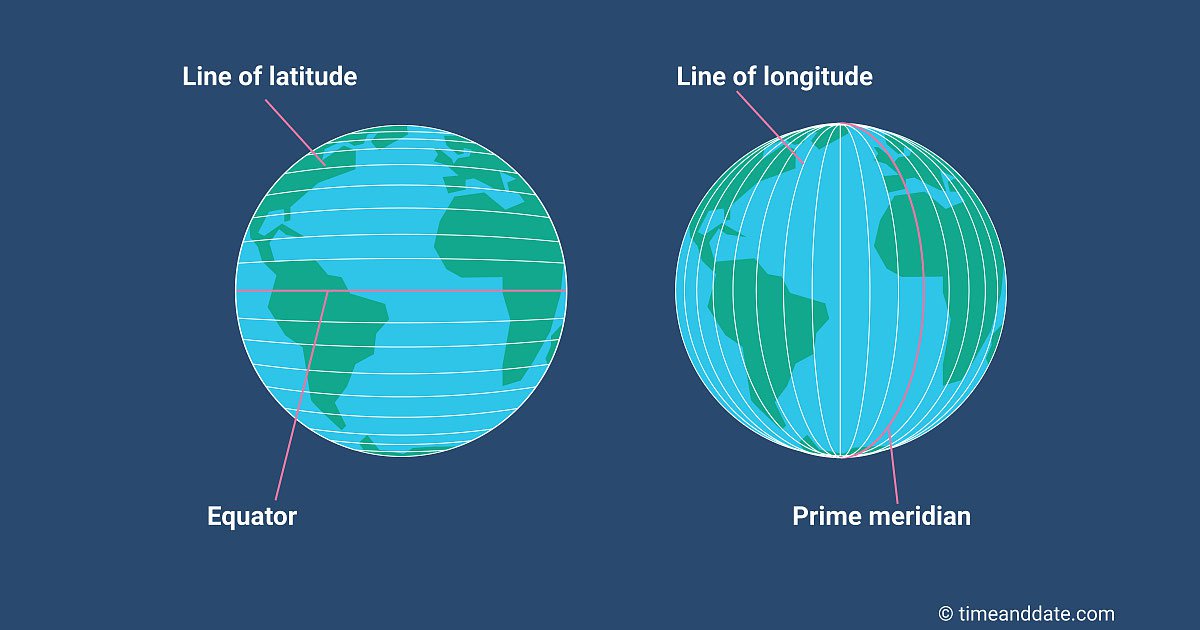
To identify exact locations on the surface of the Earth, we use a geographic coordinate system.
For example, try searching for 37.971441, 23.725665 on Google Maps. Those two numbers point to an exact place - the Parthenon in Athens, Greece. The two numbers are coordinates defined by the CRS.
Even though the Earth is a 3-dimensional sphere, we use a 2-dimensional coordinate system of longitude (vertical lines running north-south) and latitude (horizontal lines running east-west) to identify a position on the Earth's surface. Converting a 3D sphere (the globe) into a 2D coordinate system introduces some distortions. We will explore those distortions in the next section on Map Projections.
Note: No CRS is perfect
Any choice of CRS involves a tradeoff that distorts one or all of the following:
- shape
- scale/distance
- area
Very Important!!! Most mistakes in geospatial analyses come from choosing the wrong CRS for the desired operation. If you do not want to spend days and nights debugging, read this section thoroughly!
Common CRS pitfalls:
- Mixing coordinate systems: When combining datasets, the spatial objects MUST have the same reference system. Be sure to convert everything to the same CRS. We show you how to perform this conversion below.
- Calculating areas: Use an equal-area CRS before measuring a shape's area.
- Calculating distances: Use an equidistant CRS when calculating distances between objects.
Map Projections
A map projection flattens a globe's surface by transforming coordinates from the Earth's curved surface into a flat plane. Because the Earth is not flat (I hope we agree here), any projection of the Earth into a 2D plane is a mere approximation of reality.
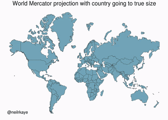
In reality, the Earth is a geoid, meaning an irregularly-shaped ball that is not quite a sphere. The most well-known projection is the Mercator projection. As shown in the above gif, the Mercator projection inflates objects that are far from the equator.
These inflations lead to some surprising revelations of our ignorance, like how the USA, China, India, and Europe all fit inside Africa.
Georeferencing
Georeferencing is the process of assigning coordinates to vectors or rasters to project them on a model of the Earth’s surface. It is what allows us to create layers of maps.
With just a click within Google Maps, you can change seamlessly from satellite view to road network view. Georeferencing makes that switch possible.
Geocoding
Geocoding is the process of converting a human-readable address into a set of geographic coordinates. For example, the Parthenon in Athens, Greece, is at latitude 37.988579 and longitude 23.7285437.
There several libraries that handle geocoding for you. In Python, geopandas has a geocoding utility that we'll cover in the following article.
Python geospatial libraries
In this article, we'll learn about geopandas and shapely, two of the most useful libraries for geospatial analysis with Python.
Shapely - a library that allows manipulation and analysis of planar geometry objects. pip install shapely.
Geopandas - a library that allows you to process shapefiles representing tabular data (like pandas), where every row is associated with a geometry. It provides access to many spatial functions for applying geometries, plotting maps, and geocoding. Geopandas internally uses shapely for defining geometries.
Shapely
What can you put into geometry?
The basic shapely objects are points, lines, and polygons, but you can also define multiple objects in the same object. Then you have multipoints, multilines and multipolygons. These are useful for objects defined by various geometries, such as countries with islands.
Let's see how that looks:
import shapely
from shapely.geometry import Point, LineString, Polygon, MultiPoint, MultiLineString, MultiPolygonShapely defines a point by its x, y coordinates, like so:
Point(0,0)%22%3E%3Ccircle%20cx%3D%220.0%22%20cy%3D%220.0%22%20r%3D%220.06%22%20stroke%3D%22%23555555%22%20stroke-width%3D%220.02%22%20fill%3D%22%2366cc99%22%20opacity%3D%220.6%22%20%2F%3E%3C%2Fg%3E%3C%2Fsvg%3E)
We can calculate the distance between shapely objects, such as two points:
a = Point(0, 0)
b = Point(1, 0)
a.distance(b)1.0Multiple points can be placed into a single object:
MultiPoint([(0,0), (0,1), (1,1), (1,0)])%22%3E%3Cg%3E%3Ccircle%20cx%3D%220.0%22%20cy%3D%220.0%22%20r%3D%220.0324%22%20stroke%3D%22%23555555%22%20stroke-width%3D%220.0108%22%20fill%3D%22%2366cc99%22%20opacity%3D%220.6%22%20%2F%3E%3Ccircle%20cx%3D%220.0%22%20cy%3D%221.0%22%20r%3D%220.0324%22%20stroke%3D%22%23555555%22%20stroke-width%3D%220.0108%22%20fill%3D%22%2366cc99%22%20opacity%3D%220.6%22%20%2F%3E%3Ccircle%20cx%3D%221.0%22%20cy%3D%221.0%22%20r%3D%220.0324%22%20stroke%3D%22%23555555%22%20stroke-width%3D%220.0108%22%20fill%3D%22%2366cc99%22%20opacity%3D%220.6%22%20%2F%3E%3Ccircle%20cx%3D%221.0%22%20cy%3D%220.0%22%20r%3D%220.0324%22%20stroke%3D%22%23555555%22%20stroke-width%3D%220.0108%22%20fill%3D%22%2366cc99%22%20opacity%3D%220.6%22%20%2F%3E%3C%2Fg%3E%3C%2Fg%3E%3C%2Fsvg%3E)
A sequence of points form a line object:
line = LineString([(0,0),(1,2), (0,1)])
line%22%3E%3Cpolyline%20fill%3D%22none%22%20stroke%3D%22%2366cc99%22%20stroke-width%3D%220.0432%22%20points%3D%220.0%2C0.0%201.0%2C2.0%200.0%2C1.0%22%20opacity%3D%220.8%22%20%2F%3E%3C%2Fg%3E%3C%2Fsvg%3E)
The length and bounds of a line are available with the length and bounds attributes:
print(f'Length of line {line.length}')
print(f'Bounds of line {line.bounds}')Length of line 3.6502815398728847
Bounds of line (0.0, 0.0, 1.0, 2.0)A polygon is also defined by a series of points:
pol = Polygon([(0,0), (0,1), (1,1), (1,0)])
pol%22%3E%3Cpath%20fill-rule%3D%22evenodd%22%20fill%3D%22%2366cc99%22%20stroke%3D%22%23555555%22%20stroke-width%3D%220.0216%22%20opacity%3D%220.6%22%20d%3D%22M%200.0%2C0.0%20L%200.0%2C1.0%20L%201.0%2C1.0%20L%201.0%2C0.0%20L%200.0%2C0.0%20z%22%20%2F%3E%3C%2Fg%3E%3C%2Fsvg%3E)
Polygons also have helpful attributes, such as area:
pol.area1.0There are other useful functions where geometries interact, such as checking if the polygon pol intersects with the line from above:
pol.intersects(line)TrueWe can also calculate the intersection:
pol.intersection(line)%22%3E%3Cg%3E%3Ccircle%20cx%3D%220.0%22%20cy%3D%221.0%22%20r%3D%220.0324%22%20stroke%3D%22%23555555%22%20stroke-width%3D%220.0108%22%20fill%3D%22%2366cc99%22%20opacity%3D%220.6%22%20%2F%3E%3Cpolyline%20fill%3D%22none%22%20stroke%3D%22%2366cc99%22%20stroke-width%3D%220.0216%22%20points%3D%220.0%2C0.0%200.5%2C1.0%22%20opacity%3D%220.8%22%20%2F%3E%3C%2Fg%3E%3C%2Fg%3E%3C%2Fsvg%3E)
But what is this object?
print(pol.intersection(l))GEOMETRYCOLLECTION (POINT (0 1), LINESTRING (0 0, 0.5 1))It's a GeometryCollection, which is a collection of different types of geometries.
Pretty straightforward and intuitive so far! You can do so much more with the shapely library, so be sure to check the docs.
Geopandas basics
Another tool for working with geospatial data is geopandas. As we know, pandas DataFrames represent tabular datasets. Similarly, geopandas DataFrames represent tabular data with two extensions:
- The geometry column defines a point, line, or polygon associated with the rest of the columns. This column is a collection of shapely objects. Whatever you can do with shapely objects, you can also do with the geometry object.
- The CRS is the coordinate reference system of the geometry column that tells us where a point, line, or polygon lies on the Earth's surface. Geopandas maps a geometry onto the Earth's surface (e.g., WGS84).
Let's see this in practice.
# !pip install geopandas
import matplotlib
import geopandas as gpdLoading data
Let's start by loading a dataset shipped with geopandas, called 'naturalearth_lowres'. This dataset includes the geometry of each country in the world, accompanied by some further details such as Population and GDP estimates.
world_gdf = gpd.read_file(
gpd.datasets.get_path('naturalearth_lowres')
)
world_gdf| pop_est | continent | name | iso_a3 | gdp_md_est | geometry | |
|---|---|---|---|---|---|---|
| 0 | 920938 | Oceania | Fiji | FJI | 8374.0 | MULTIPOLYGON (((180.00000 -16.06713, 180.00000... |
| 1 | 53950935 | Africa | Tanzania | TZA | 150600.0 | POLYGON ((33.90371 -0.95000, 34.07262 -1.05982... |
| 2 | 603253 | Africa | W. Sahara | ESH | 906.5 | POLYGON ((-8.66559 27.65643, -8.66512 27.58948... |
| 3 | 35623680 | North America | Canada | CAN | 1674000.0 | MULTIPOLYGON (((-122.84000 49.00000, -122.9742... |
| 4 | 326625791 | North America | United States of America | USA | 18560000.0 | MULTIPOLYGON (((-122.84000 49.00000, -120.0000... |
| ... | ... | ... | ... | ... | ... | ... |
| 172 | 7111024 | Europe | Serbia | SRB | 101800.0 | POLYGON ((18.82982 45.90887, 18.82984 45.90888... |
| 173 | 642550 | Europe | Montenegro | MNE | 10610.0 | POLYGON ((20.07070 42.58863, 19.80161 42.50009... |
| 174 | 1895250 | Europe | Kosovo | -99 | 18490.0 | POLYGON ((20.59025 41.85541, 20.52295 42.21787... |
| 175 | 1218208 | North America | Trinidad and Tobago | TTO | 43570.0 | POLYGON ((-61.68000 10.76000, -61.10500 10.890... |
| 176 | 13026129 | Africa | S. Sudan | SSD | 20880.0 | POLYGON ((30.83385 3.50917, 29.95350 4.17370, ... |
177 rows × 6 columns
If you ignore the geometry column (a shapely object), this looks like a regular dataframe. All the columns are pretty much self-explanatory.
CRS
The dataframe also includes a CRS that maps the polygons defined in the geometry column to the Earth's surface.
world_gdf.crs<Geographic 2D CRS: EPSG:4326>
Name: WGS 84
Axis Info [ellipsoidal]:
- Lat[north]: Geodetic latitude (degree)
- Lon[east]: Geodetic longitude (degree)
Area of Use:
- name: World.
- bounds: (-180.0, -90.0, 180.0, 90.0)
Datum: World Geodetic System 1984
- Ellipsoid: WGS 84
- Prime Meridian: GreenwichIn our case, the CRS is EPSG:4326. That CRS uses Latitude and Longitude in degrees as coordinates.
Note
Components of a CRS
Datum - The reference system, which in our case defines the starting point of measurement (Prime Meridian) and the model of the shape of the Earth (Ellipsoid). The most common Datum is WGS84, but it is not the only one.
Area of use - In our case, the are of use is the whole world, but there are many CRS that are optimized for a particular area of interest.
Axes and Units - Usually, longitude and latitude are measured in degrees. Units for x, y coordinates are often measured in meters.
Let's see an application for which we have to change the CRS.
Let's measure the population density of each country! We can measure the area of each geometry but bear in mind that we need first need to convert to an equal-area projection that uses meters as units.
world_gdf = world_gdf.to_crs("+proj=eck4 +lon_0=0 +x_0=0 +y_0=0 +datum=WGS84 +units=m +no_defs")
world_gdf.crs<Projected CRS: +proj=eck4 +lon_0=0 +x_0=0 +y_0=0 +datum=WGS84 +un ...>
Name: unknown
Axis Info [cartesian]:
- E[east]: Easting (metre)
- N[north]: Northing (metre)
Area of Use:
- undefined
Coordinate Operation:
- name: unknown
- method: Eckert IV
Datum: World Geodetic System 1984
- Ellipsoid: WGS 84
- Prime Meridian: GreenwichWe can now calculate each country's population density by dividing the population estimate by the area.
Note: We can access the area of the geometries as we would regular columns. Although no column contains geometry areas, the area is an attribute of the geometry objects.
world_gdf['pop_density'] = world_gdf.pop_est / world_gdf.area * 10**6
world_gdf.sort_values(by='pop_density', ascending=False)| pop_est | continent | name | iso_a3 | gdp_md_est | geometry | pop_density | |
|---|---|---|---|---|---|---|---|
| 99 | 157826578 | Asia | Bangladesh | BGD | 628400.00 | POLYGON ((8455037.031 2862141.705, 8469605.972... | 1174.967806 |
| 79 | 4543126 | Asia | Palestine | PSE | 21220.77 | POLYGON ((3127401.561 4023733.541, 3087561.638... | 899.418534 |
| 140 | 23508428 | Asia | Taiwan | TWN | 1127000.00 | POLYGON ((11034560.069 3156825.603, 11032285.2... | 681.899108 |
| 77 | 6229794 | Asia | Lebanon | LBN | 85160.00 | POLYGON ((3141154.397 4236334.349, 3117804.289... | 615.543551 |
| 96 | 51181299 | Asia | South Korea | KOR | 1929000.00 | POLYGON ((10835604.955 4755864.739, 10836040.9... | 515.848728 |
| ... | ... | ... | ... | ... | ... | ... | ... |
| 97 | 3068243 | Asia | Mongolia | MNG | 37000.00 | POLYGON ((7032142.671 6000941.853, 7107939.605... | 1.987486 |
| 20 | 2931 | South America | Falkland Is. | FLK | 281.80 | POLYGON ((-4814015.486 -6253920.632, -4740858.... | 0.179343 |
| 22 | 57713 | North America | Greenland | GRL | 2173.00 | POLYGON ((-2555525.099 8347965.820, -2346518.8... | 0.026295 |
| 23 | 140 | Seven seas (open ocean) | Fr. S. Antarctic Lands | ATF | 16.00 | POLYGON ((5550199.759 -5932855.132, 5589906.67... | 0.012091 |
| 159 | 4050 | Antarctica | Antarctica | ATA | 810.00 | MULTIPOLYGON (((-2870542.982 -8180812.656, -28... | 0.000331 |
177 rows × 7 columns
Notice how the geometry objects now have values that are in totally different units than before.
Just looking at the dataframe above, we can quickly identify the outliers. Bangladesh has a population density of around $ 1175 \space persons / km^2$. Antarctica has a near-zero population density, with only 810 people living in a vast space.
It's always better to visualize maps, though. So let's visualize!
Visualization
We can call .plot() on world_gdf just like a pandas dataframe:
figsize = (20, 11)
world_gdf.plot('pop_density', legend=True, figsize=figsize);
The above map doesn't look very helpful, so let's make it better by doing the following:
- Change to the Mercator projection since it's more familiar. Using the parameter
to_crs('epsg:4326')can do that. - Convert the colorbar to a logscale, which can be achieved using
matplotlib.colors.LogNorm(vmin=world.pop_density.min(), vmax=world.pop_density.max())
We can pass different arguments to the plot function as you would directly on matplotlib.
norm = matplotlib.colors.LogNorm(vmin=world_gdf.pop_density.min(), vmax=world_gdf.pop_density.max())
world_gdf.to_crs('epsg:4326').plot("pop_density",
figsize=figsize,
legend=True,
norm=norm);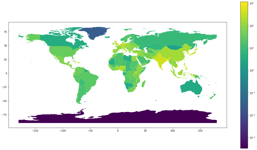
Up until now, we've gone over the basics of shapely and geopandas, but now it's time we move to a complete case study.
Case Study: The source of the 1854 cholera outbreak
We'll use modern Python tools to redo John Snow's analysis identifying the source of the 1854 cholera outbreak on London's Broad Street. In contrast to his Game of Thrones counterpart, London's John Snow did now something: the source of cholera. He learned it doing the first-ever geospatial analysis!
For this example, we'll use the data from Robin's blog. Robin did the work to digitize Snow's original map and data.
Let's first retrieve the data and unzip it in our current directory:
!wget http://www.rtwilson.com/downloads/SnowGIS_v2.zip
!unzip SnowGIS_v2.zipLet's see what's inside:
!ls SnowGIS/Cholera_Deaths.dbf
Cholera_Deaths.prj
Cholera_Deaths.sbn
Cholera_Deaths.sbx
Cholera_Deaths.shp
Cholera_Deaths.shx
OSMap.tfw
OSMap.tif
OSMap_Grayscale.tfw
OSMap_Grayscale.tif
OSMap_Grayscale.tif.aux.xml
OSMap_Grayscale.tif.ovr
Pumps.dbf
Pumps.prj
Pumps.sbx
Pumps.shp
Pumps.shx
README.txt
SnowMap.tfw
SnowMap.tif
SnowMap.tif.aux.xml
SnowMap.tif.ovrIgnore the file extensions for a moment, and let's see what we have here.
Vector Data
- Cholera_Deaths : number of deaths at a given spatial coordinate
- Pumps : location of water pumps
We can ignore the other files for the vector data and only deal with the '.shp' files. Called shapefiles, .shp is a standard format for vector objects.
Raster Data
- OSMap_Grayscale : raster - georeferenced grayscale map of the area from OpenStreet Maps (OSM)
- OSMap : raster - georeferenced map of the area from OpenStreet Maps (OSM)
- SnowMap : raster - digitized and georeferenced John Snow's original map
We can ignore the other files for the raster data and only deal with the '.tif' files. '.tif' is the most common format for storing raster and image data.
!pip install rasterio
!pip install contextilyWe've already imported geopandas and matplotlib, so all we need for the rest of the analysis is to import contextily for plotting maps. Let's import those now:
import contextily as ctxReading in data
Let's read in the Cholera_Death.shp and Pumps.shp files into geopandas:
deaths_df = gpd.read_file('SnowGIS/Cholera_Deaths.shp')
pumps_df = gpd.read_file('SnowGIS/Pumps.shp')deaths_df.head()| Id | Count | geometry | |
|---|---|---|---|
| 0 | 0 | 3 | POINT (529308.741 181031.352) |
| 1 | 0 | 2 | POINT (529312.164 181025.172) |
| 2 | 0 | 1 | POINT (529314.382 181020.294) |
| 3 | 0 | 1 | POINT (529317.380 181014.259) |
| 4 | 0 | 4 | POINT (529320.675 181007.872) |
The output looks exactly like a pandas dataframe. The only difference with geopandas' dataframes is the geometry column, which is our vector dataset's essence. In our case, it includes the point coordinates of the deaths as John Snow logged them.
Let's see what the CRS data looks like:
deaths_df.crs<Projected CRS: EPSG:27700>
Name: OSGB 1936 / British National Grid
Axis Info [cartesian]:
- E[east]: Easting (metre)
- N[north]: Northing (metre)
Area of Use:
- name: United Kingdom (UK) - offshore to boundary of UKCS within 49°45'N to 61°N and 9°W to 2°E; onshore Great Britain (England, Wales and Scotland). Isle of Man onshore.
- bounds: (-9.0, 49.75, 2.01, 61.01)
Coordinate Operation:
- name: British National Grid
- method: Transverse Mercator
Datum: OSGB 1936
- Ellipsoid: Airy 1830
- Prime Meridian: GreenwichThe other difference is that correctly defined shapefiles include metadata articulating their Coordinate Reference System (CRS). In this case, it is EPSG:27700.
Let's now briefly look at the pumps data:
pumps_df| Id | geometry | |
|---|---|---|
| 0 | 0 | POINT (529396.539 181025.063) |
| 1 | 0 | POINT (529192.538 181079.391) |
| 2 | 0 | POINT (529183.740 181193.735) |
| 3 | 0 | POINT (529748.911 180924.207) |
| 4 | 0 | POINT (529613.205 180896.804) |
| 5 | 0 | POINT (529453.586 180826.353) |
| 6 | 0 | POINT (529593.727 180660.455) |
| 7 | 0 | POINT (529296.104 180794.849) |
Similarly, pumps_df holds the positions of the water pumps near Broad Street.
Here are the pumps CRS data:
pumps_df.crs<Projected CRS: EPSG:27700>
Name: OSGB 1936 / British National Grid
Axis Info [cartesian]:
- E[east]: Easting (metre)
- N[north]: Northing (metre)
Area of Use:
- name: United Kingdom (UK) - offshore to boundary of UKCS within 49°45'N to 61°N and 9°W to 2°E; onshore Great Britain (England, Wales and Scotland). Isle of Man onshore.
- bounds: (-9.0, 49.75, 2.01, 61.01)
Coordinate Operation:
- name: British National Grid
- method: Transverse Mercator
Datum: OSGB 1936
- Ellipsoid: Airy 1830
- Prime Meridian: GreenwichNote
When dealing with geospatial data, you should make sure all your sources have the same CRS. I cannot stress this enough. It is probably the most common source of all mistakes when dealing with geospatial data.
Plotting the outbreak
We can now plot the deaths and pumps data on a map of London's Broad Street.
We'll start building the plot by first charting deaths:
ax = deaths_df.plot(column='Count', alpha=0.5, edgecolor='k', legend=True)
With a reference to ax, we can then plot the pumps in their locations, marking them with a red X. Let's also make the figure larger.
ax = deaths_df.plot(column='Count', figsize=(15, 15), alpha=0.5, edgecolor='k', legend=True)
pumps_df.plot(ax=ax, marker='x', color='red', markersize=50)<AxesSubplot:>
We would now like to show a map of London's Broad Street underneath the data. This is where we can use contextily to read the CRS data:
ax = deaths_df.plot(column='Count', figsize=(15, 15), alpha=0.5, edgecolor='k', legend=True)
pumps_df.plot(ax=ax, marker='x', color='red', markersize=50)
ctx.add_basemap(
ax,
# CRS definition. Without the line below, the map stops making sense
crs=deaths_df.crs.to_string(),
)
Now let's look at the same data, but on John Snow's original map. We can do this by changing the source parameter to SnowMap.tif, like so:
ax = deaths_df.plot(column='Count', figsize=(15, 15), alpha=0.5, edgecolor='k', legend=True)
pumps_df.plot(ax=ax, marker='x', color='red', markersize=50);
ctx.add_basemap(ax,
crs=deaths_df.crs.to_string(),
# Using the original map, hand-drawn by Snow
source="SnowGIS/SnowMap.tif"
)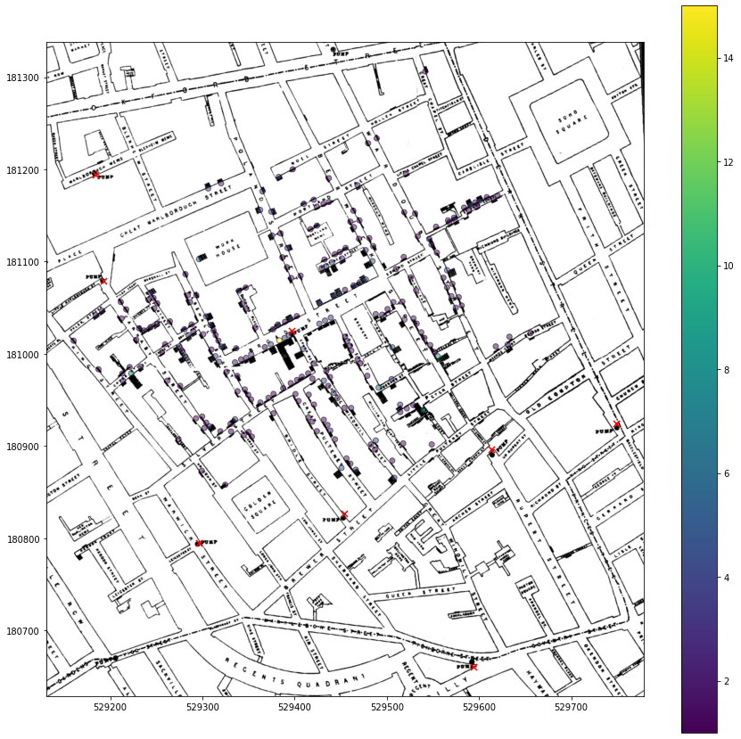
John Snow understood that most cholera deaths were clustered around a specific water pump at the intersection of Broad Street and Lexington Street (red X near the middle of the map). He attributed the outbreak to an infected water supply at that pump.
It's interesting to see how little the area has changed since 1854.
Conclusion
In this article, we have had a small glimpse of what you can do with geospatial data:
- We covered the basic notions that you need to understand to work with geospatial data. You should know the difference between a vector vs. raster and between geocoding vs. georeferencing. You also learned about projections, CRSs, and that Africa is HUGE!
- We covered the basics of shapely and geopandas, allowing us to work with geospatial vectors.
- Lastly, we reincarnated the first geospatial analysis. We found the infected water pump that was the source of the 1854 cholera outbreak in London.
Follow us for the following articles where we:
- dive deeper into geopandas, preparing and analyzing a geospatial dataset
- do machine learning with geospatial data!
After this series, you'll be ready to carry out your own spatial analysis and identify patterns in our world!
More Resources
A good place to find free spatial datasets is rtwilson's list of free spatial data sources.
You can download free satellite imagery from NASA's portal or Copernicus.
Consider enrolling in a course to learn more about how to handle spatial data.
Meet the Authors

MEng in Electrical and Computer Engineering from NTUA Athens. MSc in Big Data Management and Analytics from ULB Brussels, UPC Barcelona and TUB Berlin. Has software engineering experience working at the European Organization for Nuclear Research (CERN). Currently he is working as a Research Data Scientist on a Deep Learning based fire risk prediction system.

